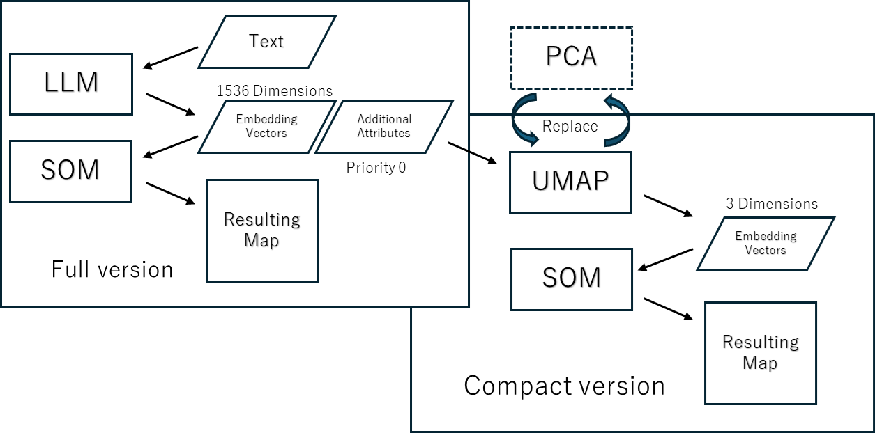
Explanation of underlying data
Innovation Maps are created by using text Embedding Vectors to order SOM’s nodes. For now, we use OpenAI API. The Emedding Vectors have 1536 dimensions. SOM is capable of learning thousands of dimensions of data, so we run it and create a basic map.
However, due to the following issues, we also create a version of the map with a reduced dimension of the embedding vector:
- In order to share the resulting map with a wider audience, we need to use free version of software with limited functionality.
- With ultra-high-dimensional data, it is difficult to adjust the analytical context by selecting and weighting attributes.
We initially used PCA for this purpose, and experiments showed that we could reduce the dimensionality down to 15 and still obtain maps that were largely interpretable.However, with PCA, any reduction in dimensionality always means some information is discarded. To preserve exactly the complete information, we must use as many PCs as there are original dimensions. As we gained experience, it became clear that dimensionality reduction with PCA produced map orderings that were sometimes difficult to interpret partially, and we were tempted to abandon dimensionality reduction altogether.
So we tried two new dimensionality reduction methods, t-SNE and UMAP, and to our surprise, they produced interpretable maps even when reduced to 3 dimensions. UMAP in particular is even more powerful.
UMAP allows to choose the number of dimensions beyond 4, so I tried it with 15 dimensions, but that didn’t seem to improve the quality of the map any further.
We won’t go into the detailed principles of the algorithms here, but to briefly explain, while PCA is a linear dimensionality reduction method, t-SNE and UMAP are nonlinear dimensionality reduction methods, and UMAP appears to be a method that preserves the topological structure of the data based on a neighborhood graph.
SOM also preserves the topological structure of the data, but in the case of SOM, the topological structure is given by the lattice from the beginning, and it is not acquired from the data. In this respect, SOM can be said to be a simplified method.
However, UMAP outputs low-dimensional coordinate values, which can only be visualized using 2D or 3D graphs or SOM. We leverage the results of UMAP using the mining capabilities of Viscovery SOMine.
 Process of map creation
How to read the relationships between Attributes
We have also information about the keywords in each document (papers, news articles, ideas). They do not contribute to the ordering of the map, but are added with priority 0. The free version of the map contains no keywords, but the reduced version contains 70 to 80 keywords, and the full version contains thousands.
This allows you to read the relationship between keywords and Embeddings on the map and interpret the meaning of each dimensional axis of Embeddings. To make it easier to see the relationships between attributes, you can sort attribute images by their mutual similarity (correlation). To do so, right mouse button click on the attribute pictures and select “Attribute” in the botom of the popup menu. To do this, right-click on the attribute pictures and select Attributes at the bottom of the pop-up menu. Then “Attribute” dialog box appear. And then, select “Similarity” in the “Sort order”. (By the way, selecting “Data” will return to the order of the attributes in the data mart.)

In the above picture, we can see that “PC2” has positve correlation with “Metaverse”, and negative correlation with “haptic”. A higher priority on PC2 would emphasize these context.
<< How to change the number of clusters
How to interprete the concept of selected group >>
^Tutorials top