In the previous time, we created maps from technical papers on Autonomous Vehicles; this time deals with news articles.
Procedure
The term “Autonomous Vehicles” has been paraphrased as “Automated Car,” “Self-Drive,” and “Self Driving” etc. “Self Driving” seems to be the most commonly used on news sites today. In this case, we organized the titles of 1487 news articles obtained by using “Self Driving” as a search term. The results of a search of articles from the past 30 days on March 20 were used. However, since the exact same article appeared on numerous sites, the total number of articles would be 713 if duplicates were removed. Yet still each site reports the same important facts as an unique article.
The significant news is Apple’s withdrawal from the development of the Self Driving Car and the partnership between Nissan and Honda. Apple’s entry into the Self Driving Car business symbolized a threat to existing automakers, who feared that the auto industry would shift to a home appliance business model, but we would can say now auto industry is returned to original players.
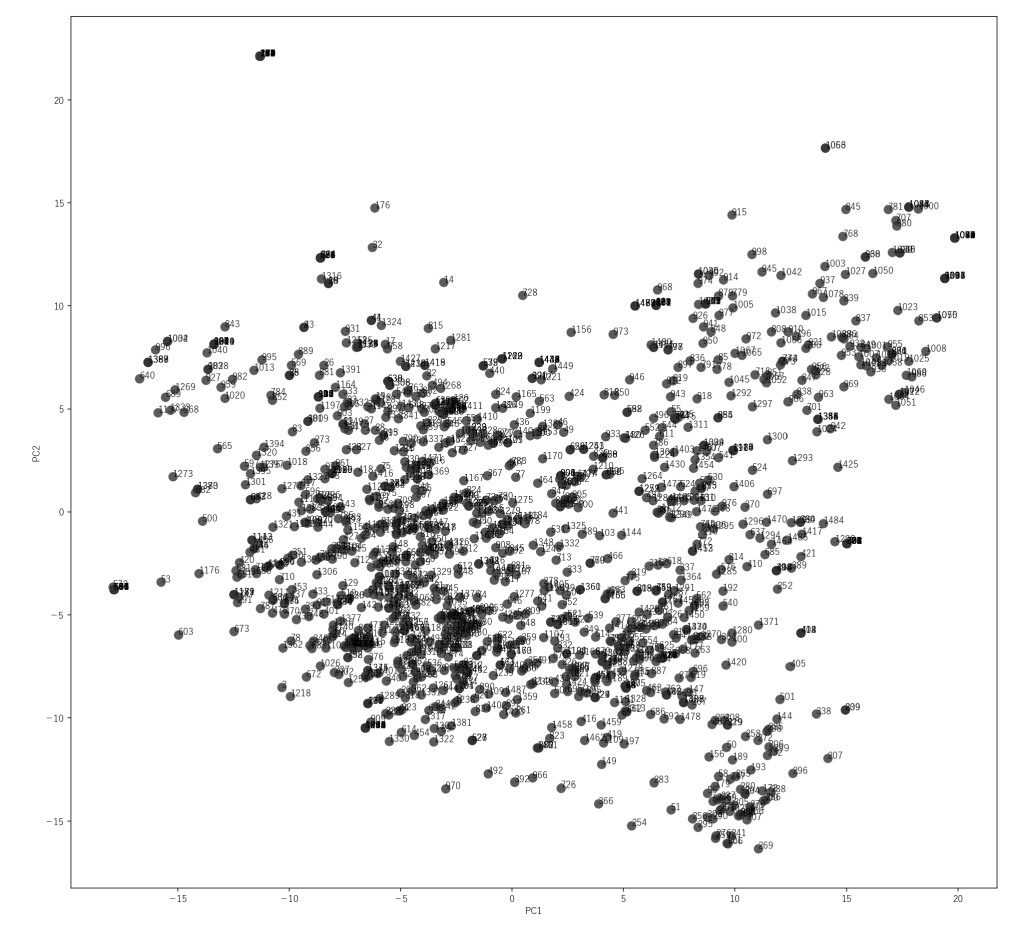
We obtained Embedding Vectors from each news title. The vectors have 1536 dimensions, but Viscoery SOMine’s capabilities are sufficient to handle them. However, PCA was used to reduced the number of dimensions to 15 so that it could be displayed with free module (Visual Explorer). In addition to that, we defined 30 features and let the OpenAI API answer which features each news title contained. When the prompt was set to allow respondents to answer “Other” if none of the 30 characteristics were applicable, 396 of the 713 responses (55.5%) were answered “Other. The number of “Replace ment” articles (articles containing content indicating that old technology is being replaced by new technology) was zero.
The accuracy of feature extraction by LLM has to be evaluated as a level where the featurs of more than half of ariticles are not properly extracted at this point. However, in order to interpret the clustering results from Embedding Vectors, it is useful to focus on the relationship between the extracted features and PCs which summerise Embedding Vectors.
From a KJ method perspective, we believe that clustering by Embedding Vectors should be interpreted as being similar to “classifying by regulatory concept,” which the KJ method prohibits. The classification of things can be altered by changing perspectives. This is the very source of creative thinking. It is already a known fact that, given the ugly duckling theorem, there can be no absolute taxonomy. However, we dare to use Embedding Vectors. The reason for this is to obtain a reference starting point for the analysis.
Resulting Maps
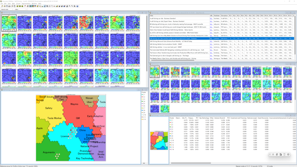
First, to obtain the mapping ordered by Embedding Vectors, each component of EmbeddingVectors is given priority (weight) 1 and the defined features are given priority 0. And then, Second, to obtain the mapping which is more easy to understand form perspective of defined features, priority 1 to Embedding Vestors and 0.5 to defined features (The Image bellow).
Since the accuracy of feature extraction by LLM is not high, it is not possible to give higher priority to features any further at this time. However, it does have some effect in helping the interpretation of the map. For example, PC1 can be inferred to be related to “Early Adoption” and “World First”. In this map, technical topics are clustered in the lower right area.
There are various ways to explore the map, but the first thing to try is to display Nearest Nodes. Select “Map/Nearest Nodes” from the menu, and a red dot will appear on the map. In the menu “Map/Nearest Nodes option…” to lower the number of Nearest Nodes to about 20, and select “Nearest Nodes” from the selector at the bottom of the menu, the articles in the neighborhood of the currently selected node will be displayed in the Data Records Window.
Clicking on the title of an article of interest in the Data Records Window will re-select the Nearest Nodes around that article and display similar articles; clicking on the URL will jump you on that page (if the page still exists).
Based on an approach such as the GTA, the information being collected can be assembled to produce a research report. Subdivide clusters as much as possible, and summariz information for each cluster. If a SOM-Ward cluster is selected, the clusters have a hierarchical (tree structure), so placing the summarized text along this structure will produce a report.
Viewer:
You can display this map with free software module of Viscovery SOMine Visual Explorer. Please download English version from here (Windows 10 or higher required). Japanese version is here.
SOM file:
And you can download the map file from here: map1, map2. However please note that underlying data mart is not included, so there is some limitation to explore and analyse it.
If you are interested in this map, you can become “paid E-mail member” of Mindware Innovation Maps, so that you have access to the project file including data mart, and “paid license member can access to full functionalities to mine data which unreduced dimensions. <read more…>